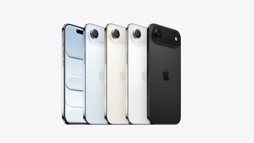
In the world of smartphone design, where rectangular screens are ubiquitous, color and finish have become crucial differentiators. With the iPhone Air, Apple is using a new color palette explicitly designed to “evoke lightness,” making the aesthetic a core part of the product’s identity.
This is more than just offering new shades; it’s a form of sensory branding. The chosen colors—likely softer, muted, or pearlescent tones—are meant to work in harmony with the phone’s physical properties. The lightness of the titanium body is complemented by a visual language of lightness, creating a cohesive and elegant product experience.
This strategy appeals to a design-conscious consumer who appreciates nuance. The choice of color becomes a form of personal expression, and Apple’s curated palette guides that choice within a specific, sophisticated theme. It transforms the phone from a neutral piece of technology into a carefully considered fashion accessory.
While technical specs like processing speed and battery life are important, they are invisible qualities. Color and feel are immediate and constant. By focusing on a palette that reinforces the “Air” identity, Apple is using design to communicate the product’s core message before the screen is even turned on.